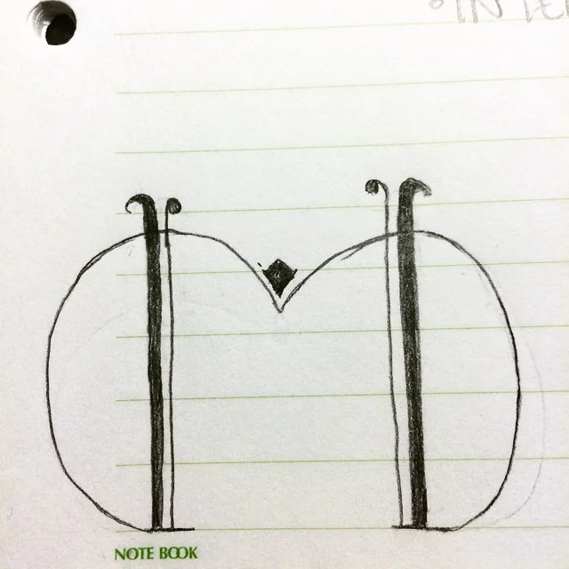
I came up with the idea for this week's drop cap M about four days before hand. I was sold on the idea from the second it popped into my head. I believe this letter M is strong in concept, but could use a little more contrast in the strokes, or smaller loops on the sides to draw the attention to the letter itself. I may get rid of the loops altogether. I think before I take these into Illustrator, I'm going to fine tune them on paper first.

